DAW 2
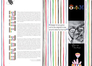
The five basic principles of layout and composition help to elevate design are Proximity, White space, Alignment, Contrast, and Repetition. Proximity is being able to visual space and put related items together so everything is not disorganized. White space is negative space that helps you define and separate different sections and gives you room to breathe, so your magazine spread is not in a cluster. Alignment is to be consistent. For example, fonts, pictures, titles, etc. The purpose of alignment is to keep your magazine spread organized. Contrast is one item that is different from another. It helps you catch the readers eye and creates empathize or calls attention to something important. Hierarchy is like contrast except it shows you where to begin and where to end. Repetition is a constant look and feel by repeating things like colors, fonts, etc. It's used to keep things the same so your magazine spread is not dysfunctional with the use of different colors, fonts, heading, and some others that are used in a magazine spread by making sure that my magazine spread has alignment and that everything is organized. I can use proximity to put my items that are the same or almost the same together. I can use contrast to show the difference between pictures or wording used in my magazine spread. White space can be used to separate different sections, I can use this in my magazine spread to apply information that differ from each other and some that are similar to one another. Repetition can be used for me to have a constant flow of things I choose to put in my magazine spread.


Comments
Post a Comment