Posts

Showing posts from January, 2021

Codes & Convention

Image
  The conventions of this scene is the character, the theme, and the situation. The codes of this scene is the lighting, the sound, the visual, text and graphic's. The theme is based in the streets where the character rides his bike and goes to the basketball court. Then it takes you back to him riding his bike in which he ends up in a situation, where he bargains with the store owner and his son for a grape soda and jerky. In this scene the lighting goes from light to dark as the day goes by and shows graphic spray painting and graphic texts on the wall as the character rides his bike through the scene. In this scene there are a lot of camera movements, the camera man takes shots from low angles, high angles, close ups, medium close ups, full shots, and a long shots. 

Elements of Narrative

Image
 1. The difference between narration and narrator is that narration is the act of storytelling and narrator is what or who tells the story, 2. The difference between omniscient and restricted narration is that omniscient narration allows entry to all facets of the story, restrictions and restricted narration limits the details it gives to the audience to stuff that a single character knows. 3. The difference between the camera narrator and a third-person narrator is that the camera narrator consists of the many visual elements that each shot captures and arranges in every composition and a third-person narrator voice over is not in the movie. The difference between a first person narrator and a third-person narrator is that a first-person enables viewers to hear one narration when following the narration of the camera and a third-person narrator voice is not in the movie. 4. Yes, a major character can be flat because different story types require different approaches to character trait

DAW 2

Image
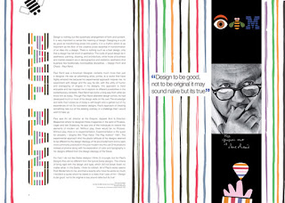
 The five basic principles of layout and composition help to elevate design are Proximity, White space, Alignment, Contrast, and Repetition. Proximity is being able to visual space and put related items together so everything is not disorganized. White space is negative space that helps you define and separate different sections and gives you room to breathe, so your magazine spread is not in a cluster. Alignment is to be consistent. For example, fonts, pictures, titles, etc. The purpose of alignment is to keep your magazine spread organized. Contrast is one item that is different from another. It helps you catch the readers eye and creates empathize or calls attention to something important. Hierarchy is like contrast except it shows you where to begin and where to end. Repetition is a constant look and feel by repeating things like colors, fonts, etc. It's used to keep things the same so your magazine spread is not dysfunctional with the use of different colors, fonts, heading, a

Movie Reflection

Image
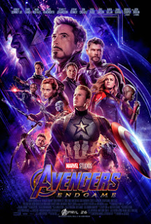
Cinematic language is characterized as the structures, techniques, or convention agreed by which the films interact with the viewer. A continuity of editing technique that smoothes the transition between shots depicting a single event from various camera angles is meant by cinematic language. It is important to the way the movies communicate with viewers because it offers the audience a more nuanced sense. For instance, if your trying out for a role, of a buffed superhero then the steps you would take will be to get in shape and workout everyday. This is how the actor would communicate with the audience. I feel like emotional scenes really engage with the viewer because they really have to dig deep for the actor to make their tears look genuine. Cinematic language is important because it helps to establish the requisite ties that will improve the plot's validity and plausibility. It could be from an action movie to a scary movie either way they all communicate with their audience.